Aspecta
Refresh Brand Identity
The Brand & Concept
Aspecta is a LVT flooring company that has been around for 100 years. They deliver high quality products and feel their brand should reflect that as well. A new rebranding should put Aspecta on the market as the premium brand they always have been.
Aspecta wanted a complete rebranding. From a new clear strategic vision & mission to a corporate
identity and visual identity. As a team we came up with the tagline:
“Aspecta paves the way, for you, everyday.”
Aspecta paves the way for a carefree floor. All projects start from the ground up, and flooring is
the foundation you need to build upon for a customer’s dream home or office space.

Visual Style
As shown below there was a 3D logo of the cube which they wanted to keep as their logo.
I gave the cube a transparant look to step away from the outdated 3D block look.
Besides the logo, Aspecta was using a wide range of different vibrant colours which
don't really resonate with a premium feel brand.
We looked at more select colour palette with earthy tones, grey/blue and orange
being the primary colours. The palette still offers a lot of colours to be able to set
different collections and products apart.

Brand in Action
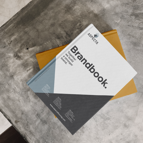
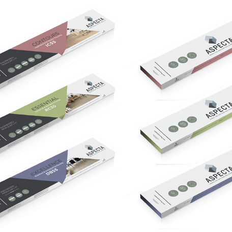
For this rebranding we set up a whole new brand book and visual identity guidelines. After this was delivered I managed the outlook of the website anddesigned the stationary products and packaging mockups.
Overall Aspecta has a friendly look while still being
a premium brand.


