Hunting Foxes
Brand Identity
The Brand & Concept
WeConnect launched a new label focussing only on recruitment marketing.
This label would be a stand-alone brand with no visual connections to the WeConnect group.
The client wanted it to be bold, appealing, fresh and easy to understand.
Because recruiters are always on the hunt for the best talent out there my mind immediately made a
mind map around hunting. I started looking for animals that hunt like lions, bears, sharks but also a little
more accesable hunters like otters and our domestic cats. I researched all these hunters' characteristics
and I was completely sold on the fox: smart, funny, eager, analytic and resourceful.

Visual Style
During this process I have tried a vast amount of different colour palettes. From old fashioned
British hunting sports club to trendy bright gradient colours. However the main
colours needed to be; orange from the fox and some sort of green for the
hunting field the fox lives in.
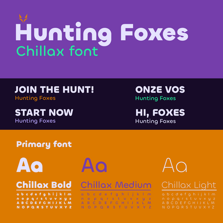
The Font I choose for headings and the logo is a bit more friendly the name and
colours, we wanted it to be bold, bright but still easy to understand with
something that resonates with a broader audience.

Brand in Action
After laying all the ground work designing all the branded assets and making brandguidelines including the brand personality, brand name, services/products & visual style it was time for me to make this brand come to life.
Starting with an appealing webdesign for desktop but especially mobile. I did the
first sketches and art direction after which we handed them over
to our website builder; Anytime.
The Brand Identity is perfectly suited for apparel design and app design.


